
To build “Pop-Up-Kort.DK,” Kristine Suhr chose Sandvox. She chose the “Distinction Grey” design for the site. People may want to visit the site if they are looking for pop-up card.
design flower card greeting kristine suhr pop-up mechanism dinner paper engineer movable tea invitation
Describe your website.
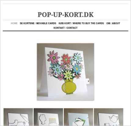
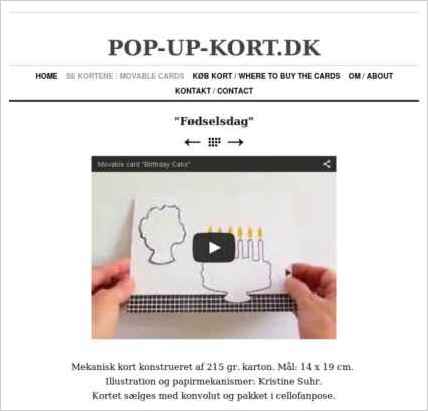
On my website www.pop-up-kort.dk, I show 5 movable cards I have designed and published. On the site you can see how the cards work, the paper mechanisms, and where it is possible to buy the cards.
Who is the target audience for your website?
Anyone interested in pop-up and movable cards and paper mechanisms.
Why did you use this Sandvox design?
I use Distinction Grey because I like that it is all white and the arrows and letters are ease to find, read and it is easy to navigate on the site. I like that there are not any disturbing effects or colors, so the focus is on what I want to show.
www.SandvoxSites.com/2820
