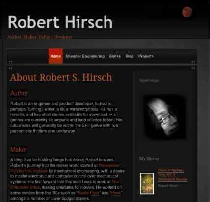
Sandvox was the choice for Robert Hirsch to build his website. He chose the “Slate Manifest Orange” design for the site. People may want to visit the site if they are looking for Robert Hirsch's books projects engineering.
book author project freelance engineering engineer ebook contract facilitation maker voluntaryism shandor
Sandvox features used for this site:Blog, Photo Grid, Site Map, Google Integration
Describe your website.
I have three main reasons for my website. The first is to help me push my books. There are three published works so far. As time goes on, I will continue to add new stories to the books webpage.
I also use it is a home base for my engineering services. I will help future clients see what I'm up to and what I do.
Finally, I'm a maker in heart. So any project I am working on I will be putting there.
Who is the target audience for your website?
People who have read my books, friends, and family. There is one page for my engineering freelance work, but most of it is really just to let people know me more.
What is the advantage of your website over others?
My website doesn't require an advantage. Its a reference place. A place for people to know something about me, and find out what I'm working on. I use it to promote my books and my engineering services, both of which I push via other avenues.
Why did you use this Sandvox design?
The simple design was exactly what I needed. The design I chose let me build out only the features I wanted (about page, photos, and a blog method of describing my projects).
Frankly, all that and the dark background was exactly what I wanted.
What techniques did you use to build this website?
None, I wanted a platform that didn't require that.
www.SandvoxSites.com/3289


