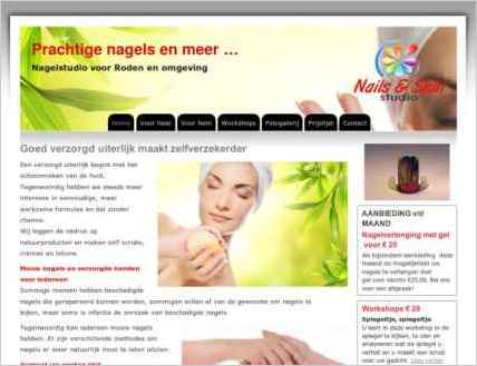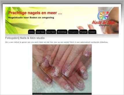
Sandvox was the choice for Ben Berwers to build his website for Nails & Skin Studio. He chose the “Blueball Pro Tabs Gray Wide” design for the site. People may want to visit the site if they are looking for nail care, manicure, pedicure.
Sandvox features used for this site:Photo Grid, Site Map, Contact Form, Raw HTML Object, Code Injection
Visit Prachtige nagels en meer ... »

Describe your website.
The website shows the possibilities and offers from the Nails & Skin studio of Ada Ovcharenko in Roden, in the north of the Netherlands. It gives prices and shows examples of her nail art.
Who is the target audience for your website?
Nails & Skin studio in Roden, the Netherlands is looking for females and males in the same city who are interested in getting there nails done and making them beautiful.
Why did you use this Sandvox design?
As Google requests websites now that [display properly] on mobile devices, which means responsive, our choice was for the Flexor design of Blueball.
www.SandvoxSites.com/3304


