
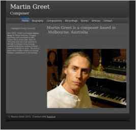
Martin Greet Composer
“As a classical composer, I wanted a website design that was simple, sophisticated. and elegant. It also needed to look professional and contemporary. The white or light grey text against a black or charcoal background appealed to me for these reasons, and also lends the site a seriousness, which is...” — Martin Greet
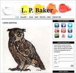
L.P. Baker
“I wanted a design that was simple, easy to navigate, looked good both on desktop and mobile browsers.” — Lindsay Baker

Landscape Photographs of Western Australia
“I particularly wanted a right hand side bar and a banner that gave the first fold maximum exposure. My black and white banner that complimented the theme colour to perfection allows my colour slideshow to leap off the page. Perfect!” — Ken Bartle

rocknwrap
“I wanted a clean white design with separating bars - no colour as the pictures and content provide that.” — Eleanor Holland
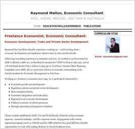
Raymond Mallon
“The design is simple and succinctly conveys information about my economic consulting services in Asia and Viet Nam without distractions.” — Raymond Mallon

Triangle Community Steelbands
“This website about the Triangle Community Steelbands in the Marysville region in Victoria Australia, provides details about the Pans on Fire, Hot Pans and Jammin' steel pan bands. The website includes a Gig Guide for each band and shows the members of each of The Bands. It also includes examples...” — Tony Richardson
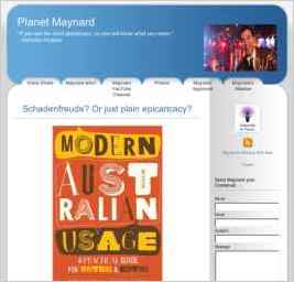
Maynard Online
“Just the simplicity and relaxed blue tones to counterbalance my manic nature. I just put up the content and I know it's going to be "all right". Need more itunes integration though.” — Peter Brooks
