
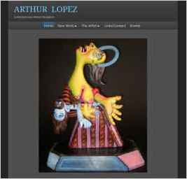
Arthur Lopez
“I felt the smooth dark was the most suitable for an artist website. The dark background helps to showcase the work in a much better way.” — Arthur P. Lopez
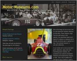
Motor-Museums.com
“Nothing special, just lots of color highlights in the text and plenty of good photographs in slideshow format.” — Richard F. Howe

TLC Doll Tours
“I chose the design because I wanted a page that had classic good taste while presenting an inviting appearance. The site had to be easy to navigate and easy to add pages and information. For now I am satisfied that the design compliments the subject matter. I hope it conveys maturity and...” — Lynn Murray
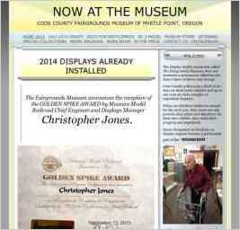
New at the Museum
“Yellow is used for attention getting, so it is a good color for a news announcement. The use of a sidebar adds continuity and coordinates the content. The graphic material selected lends dignity and importance without being heavily institutional and boring. The title of the design is Sunburst,...” — Steven S. Means

Welcome to appendicitis.pro
“In researching this website I discovered the story of a Russian surgeon who removed his own appendix in antarctica. The story includes a wonderfully graphic picture of the surgeon operating on himself.” — Jeffrey Sedlack
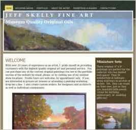
Jeff Skelly Fine Art
“I was looking for a design that would compliment my paintings and since I am a landscape painter the earthy colors matched well.” — Jeffrey Skelly
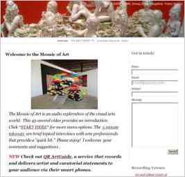
www.MosaicOfArt.com
“Through both formal and informal interviews, we engage the big themes: identity, memory, process, spirituality, etc. But we also talk about practical issues in an art professional's working life: tools and materials, organization, dealing with the business of making a living.” — George Fishman
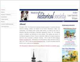
Wissahickon Valley Historical Society
“The website in my opinion is very basic. It contains written content, lots of photo's, and links to pdf files which contain newsletters, historical documents, and other info.” — John Simon
