
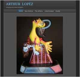
Arthur Lopez
“I felt the smooth dark was the most suitable for an artist website. The dark background helps to showcase the work in a much better way.” — Arthur P. Lopez
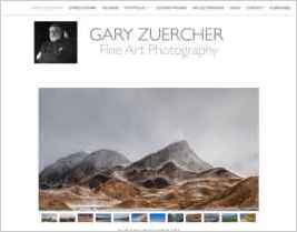
Gary Zuercher Fine Art
“I use the Hydrogen design because of the clean, simple layout and yet, it is customizable for my needs.” — Gary Zuercher

RCurtis Photography
“Since I am not a programmer, I stuck to the tools that were already built into Sandvox and I thought they worked great.” — Randy Curtis
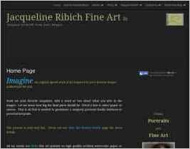
Jacqueline Ribich Fine Art
“I have so many stories that I'd love to share, but here is one that involves a wonderfully playful grand-daughter of my client and her cat. I call this little girl who I had the pleasure of drawing, Miss Personality. I had the pleasure of drawing here playful expression for her granny! ...” — Jacqueline Ribich
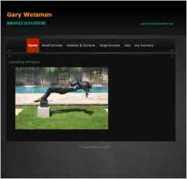
Gary Weisman
“Showcases my bronze sculpture as well as a personal plasticine clay formula. The site also includes bronze foundry photos that were taken in my personal studio using ceramic shell casting.” — Gary Weisman
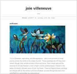
Joie Villeneuve - Fine Artist
“I chose this design for the website because it looks "clean" and uncomplicated. Not a lot in the way of distractions, therefore, the paintings could stand out.” — Joie Villeneuve
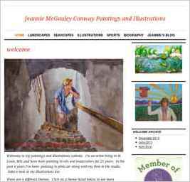
Jeanne McGauley Conway Paintings
“The design I chose was classic and had a clean look. I wanted to give the color of the oil paintings and watercolors the main emphasis. The home page has a balanced look and minimal text and simple information. As a novice web designer, it was very simple to transfer my IWeb website into the...” — Jeanne M. Conway

JosephLitzinger.com
“I wanted as blank a canvas as I could use with Sandvox (the artist in me) to make this site look very pleasing to the eye, simple and easy to view and navigate. It was important to me that the art work and artist was the main focus on each page.” — Joseph Litzinger

Galleons Lap Photography - Atelier Gallery
“I like the clean, mostly monochromatic look of the design, with just a hint of blue on the page links. It lets me use my photography to bring whatever colors I want to use.” — Seth Berkowitz

Just Plain Pix
“The purpose of our website is to promote my artwork. I am a disabled photographer and pastel painter. My artwork is one of the joys of my life and makes it easy for me to get up and face another day.” — Kym Nippes
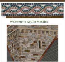
Aquilo Mosaics
“I chose the design I am using because it was very simple and allowed me to modify the banner and surroundings.” — Gerry Lavery
