
Sandvox was the choice for Steve Mouzon to build his website for The Guild Foundation Press. He chose the “NewMedia” design for the site. People may want to visit the site if they are looking for New Media resources, blogging, Twitter, websites.
video blog website image speaking discussion new media micro-blog online community mailing list idea card
Sandvox features used for this site:Blog, Custom Collection Index, Site Map, RSS Feed Object, Other Objects, Editing HTML of text, Raw HTML Object, Code Injection, Google Integration
Visit New Media for Designers + Builders »
Describe your website.
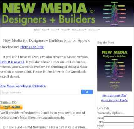
New Media for Designers + Builders is a companion website for my new book. The Home page is a blog of the latest news on the book, and contains the guestbook. The Why? How? and What? collections include summaries of each of those chapters in the book plus two other cool things I'll describe in a minute. The Media Room includes Reviews, Bios, Press, Work, and Speaking pages and the Resources collection includes the Books and Hardware I've found useful while building my own New Media nodes plus Presentations I've done on the book's ideas.
Who is the target audience for your website?
The website (and the book by the same name) each are built for designers and builders that may not necessarily have a lot of experience yet with the New Media. But while it's for beginners, it also has a lot of advanced techniques explained in common-sense, plain-spoken language. I'm also using the terms "designer" and "builder" broadly, so that they include most of us.
What is the advantage of your website over others?
This site does two pretty revolutionary things, IMO:
• I mentioned a moment ago that it includes summary pages for each section in the book. These summary pages each include a Facebook Comments module, with the intention of creating a community where everyone reading the book can comment on the book and others can see those comments.
• Each of these pages also contains a collection of posts containing material that might be applicable only to some of the readers of the book. By doing this, I'm able to reserve space in the book for only those things that everyone needs to know, with links to posts on the site for things that only some people need to know. This makes the book about ⅓ the size of a normal book where you have to slog through lots of material you may not need.
Tell us a story about this website.
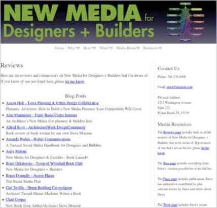
Before I launched the book, I invited people to review it. I was hoping for dozens of review offers, but got well over 200! Most of them either reviewed it on their blogs, on their online communities, or left Twitter comments so that there was a serious buzz about the book on launch day. I collected all of these on the Reviews page with links to them, with the hope of driving traffic back to all the reviewers that donated their time to talk about my book.
Why did you use this Sandvox design?
Like my other sites, Clean Sheets lets me do pretty much whatever I want on a site. It really is what the name implies.
What techniques did you use to build this website?
The coolest things about this site are the two really revolutionary things I talked about above: creating an online community accessible directly from an electronic book, and putting ⅔ of the content of the book on the web so you only have to read what you need. But beyond that, the site's content was easy to organize using Sandvox's nifty nesting collections.
www.SandvoxSites.com/2896
