
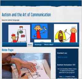
Autism and the Art of Communication
“I chose "Outside the Lines" because that describes how we work (and the visual matched our artistic content). I like the fact that we can replace the photo banner with our own picture featuring the artwork of individuals on the autism spectrum - it gives the site more individual character.” — Sheila Bell
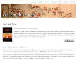
William de Lange
“It was love at first site when I saw the Hydrogen design. It is really beautiful. However, I also like some of the new designs Sandvox has released, so I might be considering an overhaul at some stage...” — William de Lange

Boreoccidentales
“Because we are encouraging email, I decided to add the Datalogica webmail w/ captcha form. This was a challenge, given my limited knowledge of HTML, but I'm patient and I got great support from Datalogica. It was really fun to incorporate a YouTube feature! I am now researching how to create...” — Erica M. Swanson

Compass Learning Services
“We chose "Distinction" (orange) for it's clean and crisp look and because it matches our company colours.” — Peter Moore
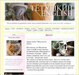
Tetushkin English
“I needed a design that was playful looking. Our whole intent was to make learning English playful, natural, and truly enjoyable.” — Mrs. Chips
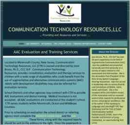
Communication Technology Resources, LLC
“To design my websites I used the text pages and then the photo page to help describe my products. I used extensive links for users to access pdf downloads with lesson plans and therapy materials.” — Joan Bruno
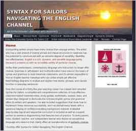
Syntax For Sailors Navigating The English Channel
“The "Imagine" design features a sailboat against an attractive sunset. What other than a nautical theme would complement a site entitled Syntax For Sailors Navigating The English Channel? It's perfect!” — William R. Miller
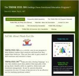
THINK FEEL DO Emotional Education
“I did the trial offer and after working with it for a few days, realized it was the perfect program to replace iWeb. I was a avid fan of iWeb, but wouldn't switch back now even if Apple decided to continue hosting mobile me!” — Deni Weber

Composition
“This design looks good and is wider than others, allowing more room for the schedule to fit easily on a page.” — Charles Nelson
