
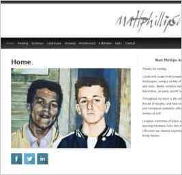
www.mattphillipsart.com
“I paint and sculpt both people and landscapes, using a variety of materials and sizes. Media includes metal fabrication, oil paint, plastic, and plaster. Throughout my painting and sculpture is the common thread of identity, and how environment and emotional conditions affect our notions of...” — Matt Phillips
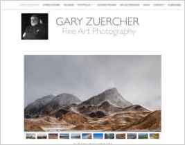
Gary Zuercher Fine Art
“I use the Hydrogen design because of the clean, simple layout and yet, it is customizable for my needs.” — Gary Zuercher
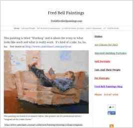
Fred Bell Paintings
“My paintings involve people and how they relate to the world around them. I start with an idea and remain open to what may evolve. In my current series, I explore the relationship between people and their cats. In the process, it is the personalities of the cats that emerge while the people become...” — Fred Bell
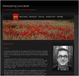
Photosite by Leon Beek
“Now that I use Sandvox, I chose a design in which I felt I could best place my photos. By using submenus, it is possible to group different subjects, which is pleasant for visitors, so they can easily find photos they would like to have a look at.” — Leon Beek
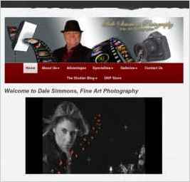
Dale Simmons Photography
“I have used some HTML Code injections. I own 3 unique URL's where I'm able to place a external link to the collection(s) of the main page.” — Dale Simmons
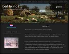
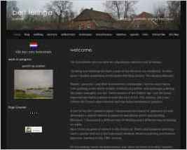
Bert Feringa
“The design Krypton Pro left side bar has a very professional look and is well suited for showing paintings.” — A Feringa
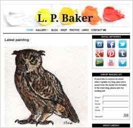
L.P. Baker
“I wanted a design that was simple, easy to navigate, looked good both on desktop and mobile browsers.” — Lindsay Baker
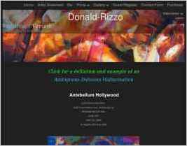
Donald-Rizzo Abstract Verism
“I'm a visual artist and my website showcases my work and style of Abstract Verism. Abstract: art that does not attempt to represent external, recognizable reality but seeks to achieve its effect using shapes, forms, colors, and textures. Verism: From the Latin word meaning “true,”...” — Donald Rizzo
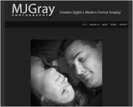
MJGray Photography
“My design choice was based on the overall appearance of the design when used with a gallery and the visual simplicity along with a dark background which gave me a little room to play in Photoshop for the image presentation. I also needed a responsive design to be viewed on phone/tablets.” — Mary J. Gray
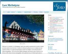
Lee McIntyre Photography
“The Lake design by Behind the Rabbit is a wonderfully elegant design that compliments the photography examples.” — L. Lee McIntyre
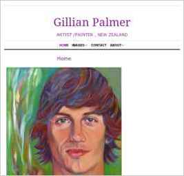
Gillian Palmer ARTIST /PAINTER IN NEW ZEALAND
“The design I chose in Sandvox is Distinction. After much consideration I decided that a clean look was needed to complement and not compete with the paintings. Also the menu type face is larger than Clean Sheets and I have the choice of changing the colour.” — Gillian S. Palmer
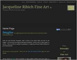
Jacqueline Ribich Fine Art
“I have so many stories that I'd love to share, but here is one that involves a wonderfully playful grand-daughter of my client and her cat. I call this little girl who I had the pleasure of drawing, Miss Personality. I had the pleasure of drawing here playful expression for her granny! ...” — Jacqueline Ribich
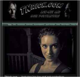
TNrick Photography Portfolio
“I chose the Night Breeze template because of the overall dark tones. Since it had a banner I could modify, I was able to place the little guy that appears on my business cards right there on each web page.” — Rick Elliott
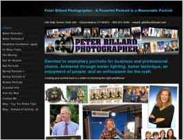
Peter Billard Photographer
“The real test of my Sandvox website is yet to come. I made it, for sure, but now it has to pull its own weight and get work for me. Prospective clients who do their homework will look at the samples of several photographers, then contact the one(s) that best fit the bill. Websites are ideal...” — Peter Billard
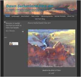
Dawn Sutherland Fine Art
“I like to feature one painting in a larger format at the top of each page, then follow that with the thumbnails.” — Dawn Sutherland
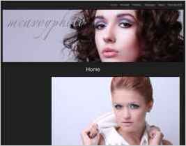
McAvoy Photo
“The current design is simple to help make the images stand out from the backgrounds. The colours are cool and soothing to help generate a relaxed atmosphere.” — James McAvoy
Christel Ibsen
“Eighteen teen years ago, I suddenly lost my hearing. From leading a productive, exciting but frazzled life - shuttling between Paris, New York and London - within a few years I had become 95% deaf. And that is when I started to paint... With the silence of deafness came peace and the blissful...” — christel ibsen
Ink Spot
“The purpose for our website design is it is crisp, clean and modern, easy to navigate, and it's our companies colors.” — Ramon Sena
Martin Photography
“My website is geared toward rodeo and equine photography and events. There are links to PRCA rodeos, CMSA cowboy mounted shooting events, NBHA barrel racing, bull ridings and more including portrait information and links to rodeo and photography related items.” — Martin Welter
www.davidalanclark.com
“The matte grey background does not fight with the images - and our site is all about the work depicted in the photographs. Also - the sans serif typeface is simple and not distracting.” — David and MJ Clark
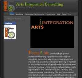
Arts Integration Consulting
“As an arts-based consulting firm, we were looking for something that had a clean, artistic edge to it--something that would convey the creativity that our company embodies.” — Sean Layne
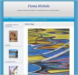
Images by Fiona Nichols
“Not yet concluded any sales, but I have great hopes. The few people who have looked at the website are very impressed by it. That is due as much to the Karelia team as to my own works.” — Fiona Nichols
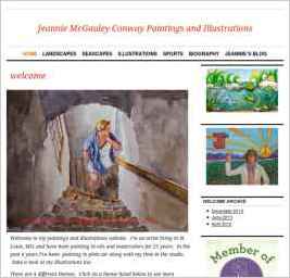
Jeanne McGauley Conway Paintings
“The design I chose was classic and had a clean look. I wanted to give the color of the oil paintings and watercolors the main emphasis. The home page has a balanced look and minimal text and simple information. As a novice web designer, it was very simple to transfer my IWeb website into the...” — Jeanne M. Conway
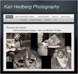
Karl Hedberg Photography
“The design selected complements my photography which is mostly in vintage monochrome (black & white).” — Karl Hedberg
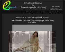
e2Photography
“Using a combination of Sandvox and JAlbums allowed me to embed video slideshows hosted on vimeo.com easily and generate simple slideshows with music reflective of the various aspects of my business.” — Steven Seelig
Christographer
“People Corporate & Events Motoring Landscapes & Nature Photoshop Print Price List” — Christopher Waddell
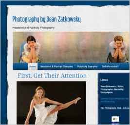
Photography by Dean Zatkowsky
“I work hard to give my photographs a three-dimensional feeling, and I liked this design because it imparts a subtle sense of dimensionality as well.” — Dean Zatkowsky
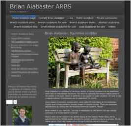
Brian Alabaster Sculptor
“The clear clean line and black background provides the perfect foil to images of my sculptures. The clever gallery system gives easy navigation around the site” — Brian Alabaster
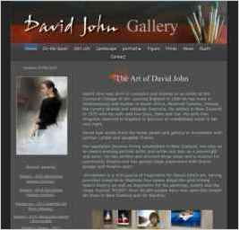
David John Gallery
“I chose Smooth Dark as my design. It looked to me to be the "no nonsense" clean design that would impress visitors.” — David John
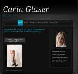
Carin Glaser Photography
“My website is designed to provide not only information on the services I provide but to allow my clients to view and order their finished products online. My goal is to display my work as well as assure my clients that they are going to get the quality and style they are looking for.” — Carin Glaser
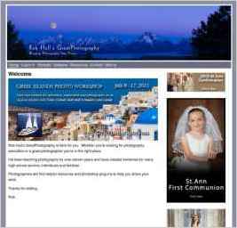
Rob Hull's GreatPhotography
“To keep the pages that describe my classes and workshop consistent, I developed a page design outside of Sandvox using a simple HTML editor (BBEdit 9). This allowed me to create bullet lists, indents etc. I can then take that HTML and, using Sandvox Pro, insert it where it's needed on any single...” — Robert Hull
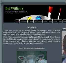
David Williams - Nottinghamshire artist
“I was attracted to its simple, unfussy format. Something more elaborate would have detracted from the display of my paintings, which is the main impact I want to make.” — David Williams
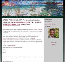
Mosaic artwork by George Fishman
“The Serengeti design provided the widest strip to display a panoramic mural that is showcased on every page. I also preferred its color palette and default fonts.” — George Fishman
bert feringa, dutch painter of landscapes and portraits
“I chose for the Blueball Trifecta red design because of the extra's . It has a very professional look and you can make it more custum made in a simple way.” — A Feringa
Hahn-Photography - Photography on the Highest Level
“I needed a black background and a supporting picture that had to do with traveling, Asia etc. The choice was obvious. It shows the only human made structure that can be seen from the moon: the Chinese Great Wall.” — Johan Hahn
Steve's Photography
“The current design was clean and totally different from the prior site. Being able to change the banner to the EYES went with my 'feelings' of photography is seen and felt through our senses. It doesn't always make since but the eyes transport the image to the brain for interpretation.” — Steven Cockerill
